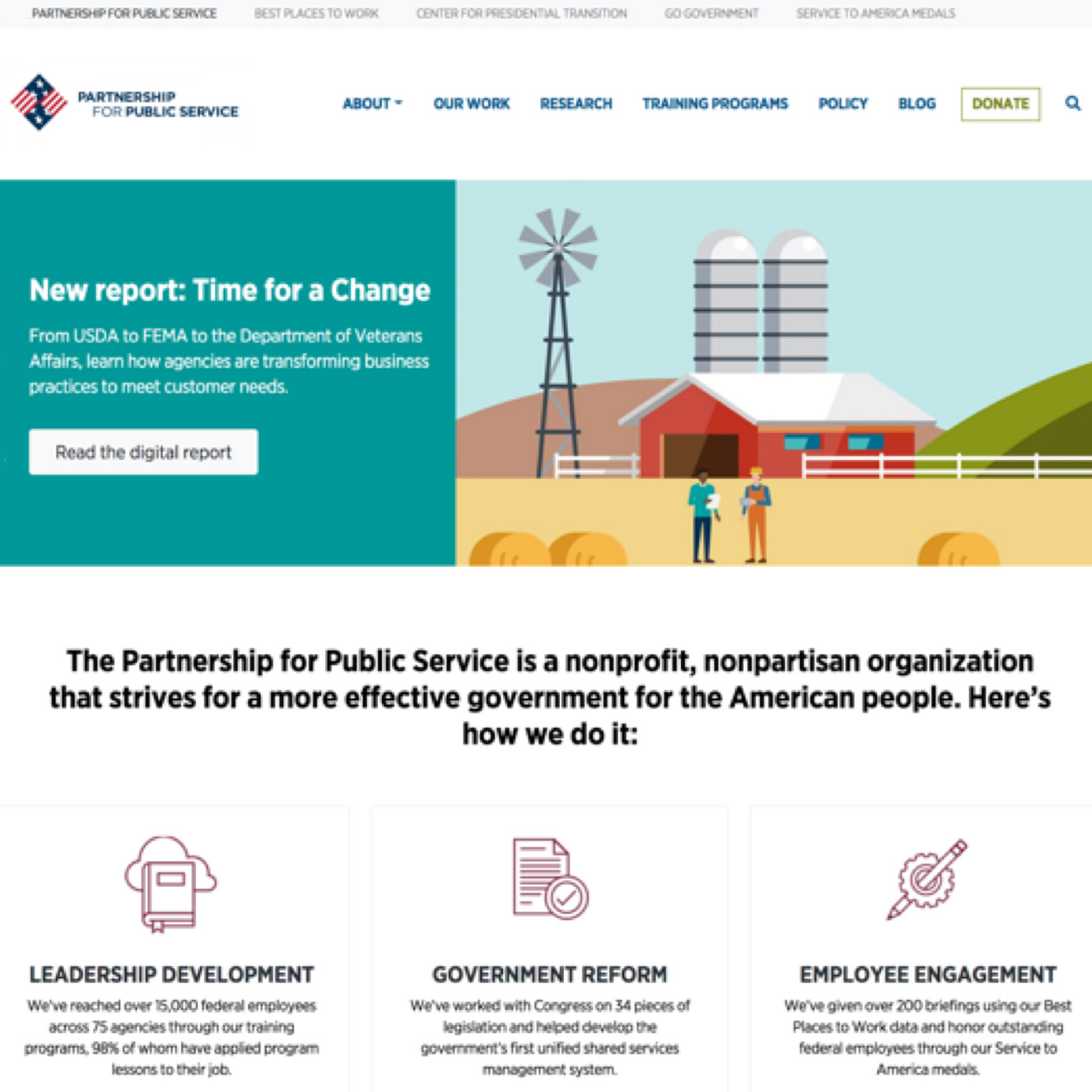
Partnership for Public Service Site Redesign
The Partnership for Public Service had seven separate websites, all hard coded, with very few brand similarities to tie them together. My task was to work with relevant stakeholders, manage a team of designers and developers to move these websites over to a single multi-site content management system, and marry design elements to create a unified visual brand.
Information Architecture
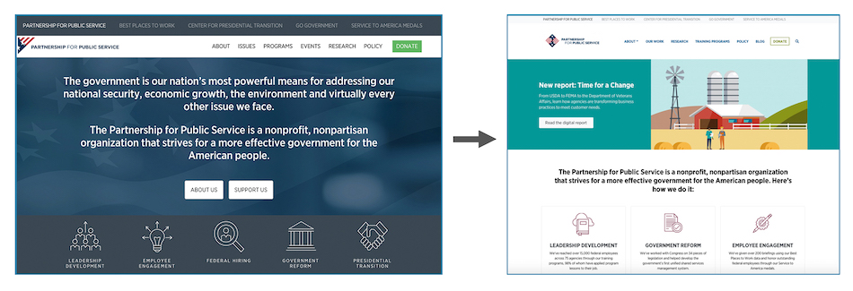
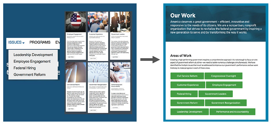
The Partnership previously talked about their work across several different sections of the site, making it confusing if a user wanted to find out a particular topic they were working on (left). I consolidated this into a main “Our Work” page, with specific issue pages that could be consistently updated with new content (right).
Updated technical features
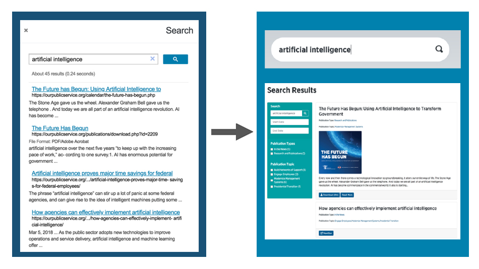
The organization previously relied on Google Custom Search, which would pop up in a modal and had no feature options (left). Using the Wordpress plugin WPSearch, we were able to add a more user-friendly, filtered search function (right).
Building unified brand identity
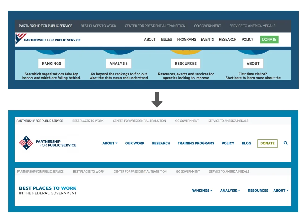
Each of the seven websites had a different look and feel, including how the navigation worked. Because of this, it was hard to tell that all of the websites were under one unified brand (top). We applied the new parent theme’s navigation across all of the sites, creating a consistent look that makes the Partnership’s brand identity more clear (bottom).
Search Engine Optimization
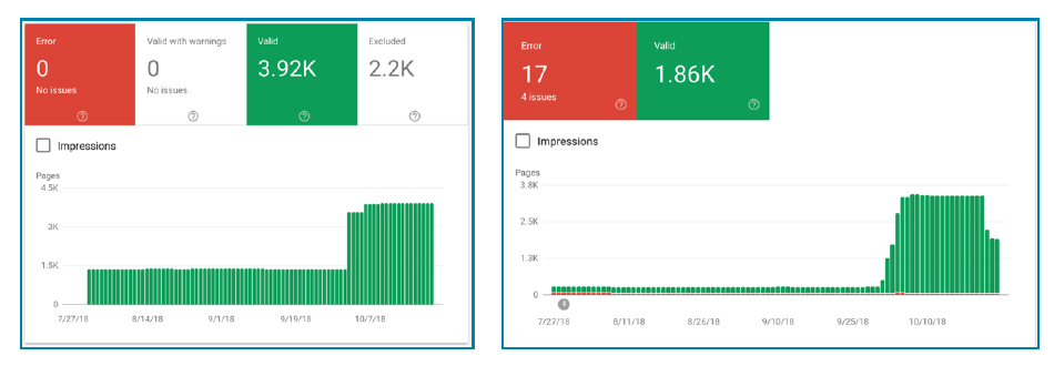
Because of our technical changes, Google was able to index three times the number of pages as it did before the CMS, making the Partnership’s content more findable through search engines (left). The site also contains three times the number of mobile-friendly pages, by Google’s definition (right).