Tech research and ethics, data visualization, UX/UI design, and writing professional.

MAB does DT

Five Goals for MFADT

It’s a real challenge to narrow it down to just five, but here are the broadest or most top-of-mind things I’d like to achieve during my two years at DT:

  1. Learn more about mixed reality (including creating XR experiences) and determine whether it’s a viable technology for mass access.
    The XR field is something I’m very interested in but know almost nothing about. I’ve heard AR and VR thrown around a lot in tech spaces, but as someone who’s been in the design field for a while, I haven’t even experienced an XR experience. If I don’t have access to it, how can a person who’s not in the design space? Is this a feasible technology that people will actually be able to access? And if so, how can we anticipate the ways in which companies will exploit people with it, and how can we combat that? I’m taking the Mirrorworlds currents course and I think that class will help answer a lot of these questions for me.

  2. Explore creating immersive experiences through projection mapping and sound design.
    As an avid museumgoer and a former resident of Washington, D.C. (where I was spoiled by all the free museums), I’ve seen more museums like the National African American History and Culture Museum and the Holocaust Museum experiment with forms of immersive experiences. I’ve found these exhibits to be extremely effective and I’m interested in learning how to create those myself. I plan to take some courses exploring these tools and perhaps do a major studio project incorporating them.

  3. Understand how machine learning works and how best to anticipate/identify bias in AI.
    I don’t really think that I want to work in the machine learning space after MFADT (though who knows at this point), but I do want to understand how it works a bit better. As someone who loves learning about emerging technology but is extremely skeptical of it, I’ve read and heard of the countless stories of bias in AI causing real harm. I don’t think it’s possible to create a completely unbiased system through machine learning, but I do want to know how to test for and mitigate it.

  4. Experiment with different ways to craft narratives, including nonlinear storytelling, through code and technology.
    I found my way to design through writing and storytelling, so one of my core goals is to learn different ways of telling stories through the various tools taught at MFADT. Whether that’s something very direct like experimenting more with text/image, or less direct like nonlinear storytelling, I hope to come out of DT with more tools to be able to tell my own stories and to help other organizations tell their stories.

  5. Determine methods to contribute to the social justice/impact space through means other than web design—or, put another way, figure out how I can utilize design and technology to help nonprofits beyond just redesigning their website.
    This is the big goal. I came to DT from the nonprofit sector, and while I’m not married to the idea of going back to nonprofit after, I am married to the idea of continuing to do social good. But nonprofits are still pretty stuck in the idea that the only way to utilize design is through print or web design (which is what I did before DT). I want to know how I can expand that out to utilize other technologies to work in the social impact sphere. I think all of the goals mentioned above are ways to contribute to this last goal, so ideally I’ll be able to work on this throughout my entire DT experience.
Twas the night before the science fair

Twas the night before the science fair

And all through New York

Students stressed about Bootcamp

And on CodePen they forked.

I sit at my laptop

And stare at my code

Willing my sound function

To finally show.

When up through my speakers

I heard a loud ding

A Slack from Elena

She’d made JavaScript sing!

Now I stare at P5

Trying to recreate it myself

In hopes that by tomorrow

I can put my subway project on the shelf.

I turn to my notebook,

And sketch my table display,

And even though I feel stressed,

I know that it’ll be done by Friday.


Concept statement: Subway Symphony introduces a new way to engage with the New York City subway: through sound. Both a digital scavenger hunt and a supplementary way to navigate public transportation, it encourages users to explore their city by collecting sounds for each subway line they ride. Based on the sounds a user has collected, they are able to create their own personal “symphony” that evolves as they ride additional lines. In a future state, Subway Symphony would also act as a musical map for those who are vision-impaired.

Mary Ann Badavi
The who/what/where/when of my project

WHAT is it?

It is a musical scavenger hunt game for riding public transportation, that has ties to both mapping and creating your own music.

WHO is it for?

It’s for riders of public transportation who want their transit experience to be more engaging and fun. It could also specifically those who are visually impaired.

WHAT does it look like?

It is an app/website that shows you the sounds you’ve collected by riding various trains on the subway, as well as an audio switchboard that allows you to mix the sounds up. It also is a bonus wearable bracelet that allows you to scan it once you board a train.

WHAT behavior does it encourage?

It encourages people to: 1. explore more of their city and ride different lines that they may not have ridden before, and 2. mix various segments of music together to form different mashups of songs.

Mary Ann Badavi
When switching prototypes helps you with your own

Sharon and I switched projects today, with Sharon getting my audio-based project and me getting her color-based one. It was helpful to compare notes for two projects that both rely so heavily on one of the five senses, and in fact that commonality led us to develop prototypes for each other that helped solve for another one of the senses.

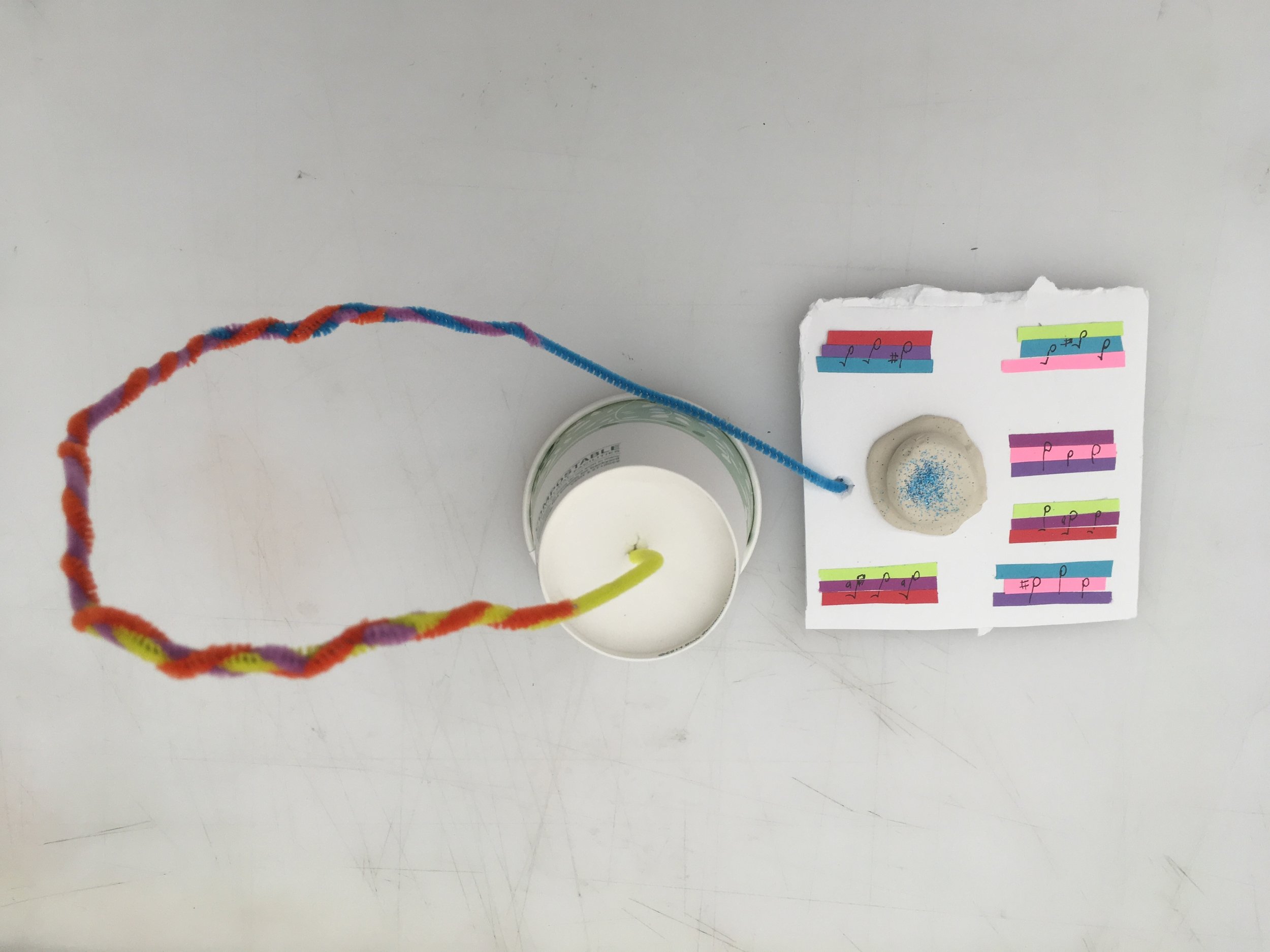
One of Sharon’s big questions that she had yet to answer was how visually-impaired people could interact with her project, which is entirely based on color and sight. To answer that question, I created a prototype that would also translate user’s moods into three sounds. Then, to simulate the feeling of seeing people’s different moods set up on trees, users could instead listen through a gallery of other audio moods.

It’s interesting that making a prototype for Sharon’s project had me create an audio experience like my own prototype, but I had to think about it in a different way using only the materials on hand. Though this prototype doesn’t actually produce audio, it gets the idea across—and creating the physical thing that users would interact with makes it seem more real.

Developing a prototype

It’s hard to come up with a prototype when your prototype is so dependent on sound—and you don’t have any instruments in your apartment!

prototype1.jpg

For my first lo-fi prototype, I simply sketched a 2D hallway of the Atlantic Avenue/Barclays Center station, with the appropriate lines. I assigned a musical note to each line: A for the 2 train, D for the 3 train, C for the B, E for the Q, G for the 4, and B for the 5. I purposely picked combinations that would create major chords, to avoid chord combinations that might cause sadness in moods. (Shoutout to the mapping episode of This American Life we listened to about everyday objects producing sad chords!)

Frustrated by my lack of keyboard (I used to have one in my old apartment), I used an online keyboard to recreate the note combinations I wanted. So for example, the 2/3 platform would sound like this:

As you go down the hallway from the main station, you would hear it as you approach the platform.

I also strung together all of the notes to form a “song” that would play at the Atlantic Ave stop (or if you were on a train approaching the stop). My thought is that these notes could be remixed by passengers in order to create new songs to play.

For my second prototype, I wanted something a little more interactive, where you would actually be able to hear the music while interacting with the prototype.

Using Adobe XD (for the first time!), I created different screens for each section of the station that would play different notes.

And now we wait for user testing!

Prototyping to fight surveillance birds

Joseph and I partnered for our in-class prototyping and immediately identified that we wanted to create a product that would address the concept of all birds becoming surveillance devices. Joseph has a background in apparel, so he came up with the idea of wearable cloaks that would have surveillance-blocking technology. Instead of just creating the actual product using fabric, we decided to create a diorama of a city street instead.

Using play-doh, we started to shape people wearing these cloaks. But because of the form of play-doh, the cloaks had more structure than regular fabric did. Because of this, we decided to make our wearable technology a little more structured. And thus, Pods were born.

IMG_7686.JPG

After we formed the Pods, we came up with the idea of accessorizing the Pods with various badges and belts, as well as different kinds of Pods—for kids, pets, couples, people in wheelchairs, etc. From there, we built the world around the Pods, creating the “surveillance birds” out of glue sticks and drawing the cityscape around the people.

Joseph created a detailed sketch of the Pods themselves, how they work, and their adaptations.

IMG_7688.JPG

Meanwhile, I created a narrative for the product, based on the prompt. My question about our technology was whether it would essentially “beat” the problem—that is, whether the surveillance pigeons would be ineffective due to our technology. Ultimately, we decided that they would, and our narrative reflects that.

Screen Shot 2019-08-07 at 10.45.54 PM.png

Creating this prototype was a great example of a team bringing each of their strengths to the table. Joseph supplied the knowledge and vision around the product itself, while I came up with some of the ideas on variation as well as the narrative context around the product.

Watching a design project take shape

Choosing three of the questions we brainstormed yesterday, we came up with some potential forms to answer them.

IMG_7674.JPG

I struggled with the first one, since I originally saw VR/AR as the form itself. However, to be more specific, I think this particular question could best be solved through an installation or experience.

Many people have tried to make public transportation easier to navigate. For form, I immediately thought of the most popular ways to do this: digitally, through websites or apps. However, I do think you could do something interesting with projection mapping in train stations to make navigation easier for passengers.

The last one was the least obvious to me. I was originally inspired to ask this question because of an article about the lack of accessibility in the DC restaurant scene (and I imagine New York has similar issues). Though traditional solutions would be through training workers and building in more accessibility ramps and tables, I think there is potential for experimental technology. There is already a whole world of wearable tech to make lives easier for those with disabilities: how can you apply that to the restaurant scene specifically? Similarly, how can you train algorithms to treat people with disabilities with more respect?

After switching forms with sectionmates, here is the question and form I ended up with:

IMG_7684.JPG

I didn't quite know what music deconstruction was, but decided to interpret it in my own way. Instead of explaining what I came up with, here’s the narrative for my project:

Jordan is a blind woman who takes the subway to work every day. She gets on the train at Franklin Ave, where there are several different lines. She hears the sound of a D major chord and follows it to her line, the 4 train. While she waits for the train to arrive, she moves to the center of the station, where there is a braille touchscreen she can use. She remixes the D major chord to form a song for the 4 train and submits it to the MTA, hoping maybe she’ll hear it on the train one day.

Once she gets on the train, she listens to the different chords that play at each stop. She knows the song that plays for Wall Street, which is her stop. As she disembarks and exits the station, she hears the other subway lines playing their own chords.

There are some potential sticking points with this project that I’ll have to think through. How do you make it so that people don’t get sick of hearing the same songs all the time? How do you account for sheer number of subway lines and stations in New York? How can you make it easier for people to remember which chords go with which stations?

These questions, though, made it easier for me to recognize the larger context of such a project, which you can see in my friction map.

IMG_7682.JPG

This project is exciting because it has the potential to help several different audiences. Blind people can use it, of course, but so can people who don’t speak English as their first language. Music is the universal language—well, that and math—so while it has its pitfalls to navigate, a project like this has the potential to be very useful.

Mind mapping three high-concept projects

Three artists whose work inspires me (described in my last post)

  • Mona Chalabi: data illustrations of social issues

  • Malika Favre: digital illustrations featuring geometric shapes and bold colors; centers women

  • Hannah Beachler: building worlds and technologies in a fictional, utopian universe

At first, I had a hard time connecting these artists with any kind of domains to research. Each of them primarily work in strictly visual environments, whether it’s pure visual art, data, or film production. But as I started to write out some potential domains for research, a few themes emerged.

Tech, bias, and racial inequality: Mona Chalabi uses data to expose social inequity, often related to race. Through her illustrations, she points out that data itself is often skewed—whether due to the collector of the data, or the criteria for the data. This leads to data visualizations just being accepted as fact rather than questioned. In DT, we look at data often through the lens of machine learning. How do our own biases affect the data that we are using to create AI?

Hannah Beachler doesn’t use technology to create her work, but she does imagine technology in her work. For Black Panther, she conceptualized the utopia of Wakanda, the most technologically advanced country in the world. It also happens to be a country that centers people of color. At first I looked at this through that same lens: how we can use future mapping to achieve racial equity. But I realized that we can use the same logic to apply to a different issue: climate change. What prospective technologies can I imagine that might help address the climate crisis?

Colors, shapes, and emotions: Mona Chalabi and Malika Favre both inspire me from a visual point of view, but if I look a deeper, it’s because they use colors and shapes in an effective way to invoke emotions. How can I utilize technology to reproduce those feelings? Projection mapping seems like a good tool for this.

Three domains to research

  • Prejudice in machine learning

  • Sci-fi prototyping for climate change

  • Projection mapping emotions using color

If you Google “racial prejudice in machine learning,” you get hundreds of hits. Horror stories of Google Photos identifying black people as gorillas, soap dispensers that don’t recognize dark skin, airport facial recognition technology providing false matches for people of color. It’s certainly well-documented, and good people are working on improving on it. But this will always be an issue, because the people working on the AI, no matter how good their intentions, have bias. There will never be a truly neutral algorithm. I’m interested in exploring how to best demonstrate that these “ooh-aah” technologies come from somewhere: a regular human with regular bias.

The organization Radical Ocean Futures uses science fiction prototyping to imagine how climate change might affect oceans and fisheries. Further still, the organization has come up with ways humans might adapt to these dramatically shifting environments. But climate change isn’t in the future; it’s here now. And despite trying to be an environmentally conscious consumer, it’s my belief that the biggest impact on climate change now is through the industries who are perpetuating climate change. I want to use future prototyping to drive activism against these companies.

Emotions and color are already inextricably linked, so I want to think about how to push that relationship further. When we feel a strong emotion, it can be all-consuming. Think of shame: when I feel embarrassed, I feel waves of heat rippling through me. We could represent that visually with actual waves of crimson shame creeping up on you. I want to artificially reproduce those emotions and make you feel those things simply through visual (and perhaps audio) stimuli.

Three concepts

  • Reverse-engineering AI to expose bias in the programmer

  • Creating a speculative object to put pressure on large companies perpetuating the climate crisis

  • Using color and geometric shapes, reproduce strong emotions through projection mapping

Truth be told, it’s a little hard for me to move from concept to project. But if we are truly doing research through making, I can hone in my concepts on very specific ideas to start testing my theories.

Three projects

  • Looking at failures in facial recognition technology for Middle Eastern people through testing, then working backwards to identify the problems in the dataset

  • Sci fi prototyping to imagine a dystopia where tech companies don’t reduce carbon emissions; and a utopia where they do

  • Reproducing the feeling of shame through audio and visual mapping

Mary Ann Badavi
Finding inspiration

Here are three women artists who inspire me on a daily basis and in my own work.

Hannah Beachler, production designer for Moonlight, Creed, Black Panther, and more. I heard her speak at a conference about considering the entire world around the films she designs for, rather than just the characters in the films. For Black Panther, she not only conceived of the sets where scenes were set in the film, she created an entire encyclopedia about how the people of Wakanda live their lives, eat the food, and raise their children. I’m inspired by her considering the entire ecosystem of the world she creates, not just the ones you see in front of you.


Mona Chalabi, data journalist and illustrator. Her data illustrations make me think about things in a different way, from wage disparity between white people and minorities to female hairiness by race. She isn’t afraid to depict things that make people uncomfortable, and she believes in simplicity in her work. She hand-draws her illustrations because she believes that keeps a human element to the data.

“For me, it’s important to show a human made this,” she says. “With computer-generated graphs, it can seem like this completely neutral, perfectly objective thing that made the chart. And that’s not true. It’s a human who makes objective decisions about which rows and which columns in the data set to show you.”

I really appreciate her outlook on data, her work in making it more accessible for everyone, and her ability to show difficult topics simply and powerfully.


Malika Favre, digital artist. Favre creates illustrations for several international publications, including The New Yorker and National Geographic. I really gravitate towards her style of bright colors and geometric shapes. She often centers women in her art, including in this favorite of mine below. I hope to eventually be able to use Adobe Illustrator half as well as she does.

Mary Ann Badavi
Question everything

How can effective storytelling by and for underrepresented groups create cultural movements?

Recent films that center and are created by people of color, such as Black Panther and Crazy Rich Asians, show that stories about non-white people can sell in Hollywood. As a result, more mainstream superhero films and romantic comedies featuring minority groups at the center are coming out. I’m interested in how these groundbreaking films utilized technology and storytelling to literally change the face of entertainment.

How can the use of old physical spaces—instead of tearing them down—enable local businesses and artisans to sell their products?

This past spring in Washington D.C., an entire block of old buildings in a popular neighborhood was set to be demolished. Before it happened, though, a local artists collective called No Kings Collective set up a free pop-up gallery for a week, featuring artists from the city who work in a variety of mediums. The gallery was hugely successful, drawing thousands of people, including Congresswoman Alexandria Ocasio-Cortez. Instead of destroying historic buildings for the sake of new businesses, how can we repurpose them so that local community members can utilize and enjoy them?

How can catering to people who have been marginalized by structural injustice improve the quality of life for everyone in a community?

Too often, neighborhood improvement boards cater to their most privileged residents, putting in new businesses tailored to them. This leads to stores that are not accessible for those in wheelchairs, restaurants that don’t let people in based on their clothing, and streets that are unsafe for those with hearing or visual impairments. I believe that neighborhoods designed by and for these groups of people would also benefit people not within those groups.

Mary Ann Badavi
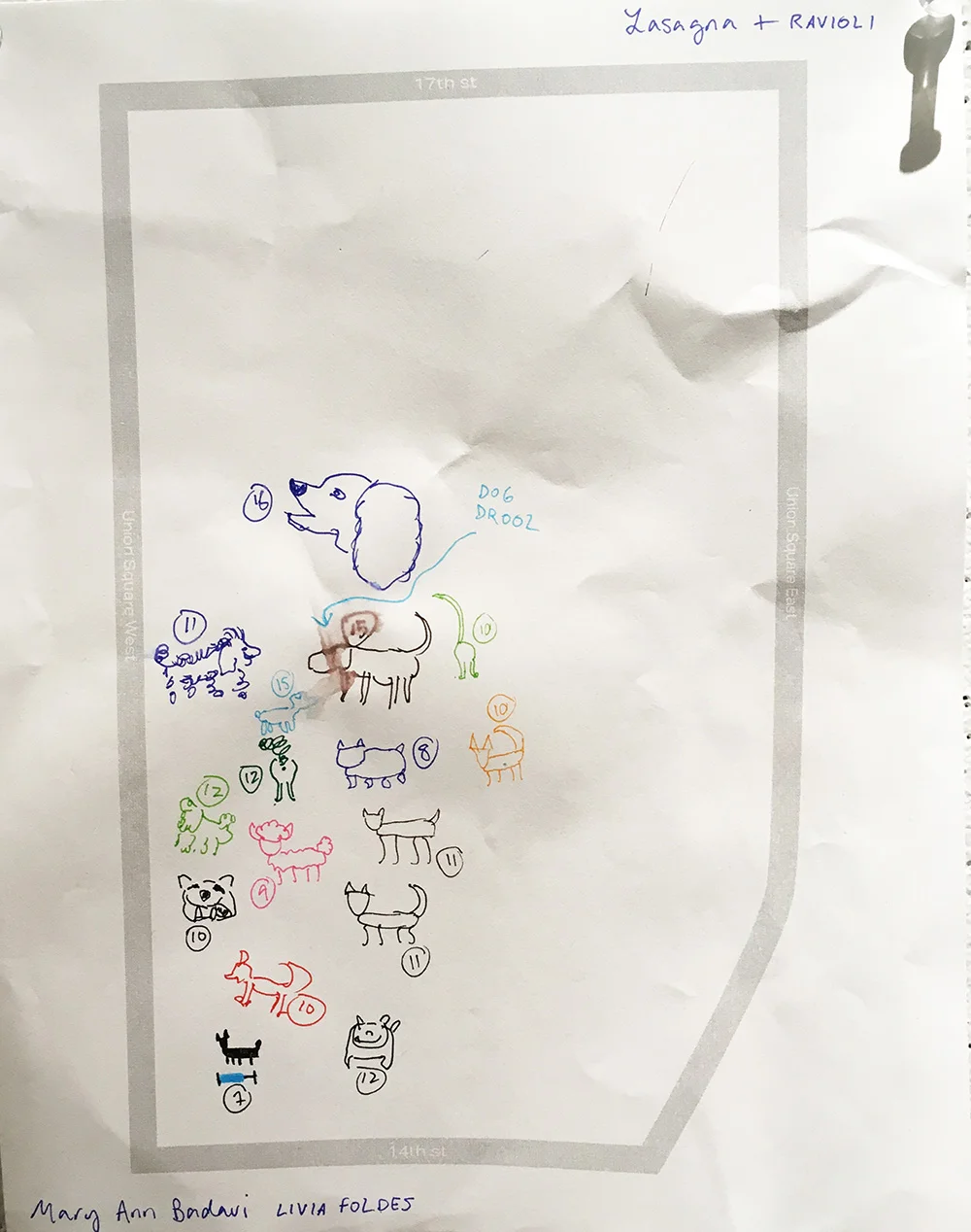
Mapping dogs by cuteness level in Union Square
IMG_8139.JPG

My partner and I decided to map dogs by cuteness level in Union Square. New York is not necessarily a pet-friendly city—there isn’t a lot of free space to roam or grass to do it on—yet there are hundreds of thousands of dogs here. When times get stressful, looking at (or petting!) a dog is truly a relief. In a bustling, overwhelming city, where everyone is rushing to their destination, what better place to have an instant reminder of pure, contagious joy. It’s more than just tracking dogs (though they’re so cute, that would be enough in and of itself); it’s about tracking people who desire dogs’ companionship.

In terms of cuteness, all dogs are adorable and perfect, so it was really just mapping an added level of what brings happiness to people.

Dog owners generally have some level of expendable income, so in a way we are mapping people who have the privilege to own a dog in an expensive city. Often cuteness level is also determined by how clean the dogs are and how well they’re groomed, which is also linked to money. But when doing observations during the day in an area with a lot of offices, many of the people we saw walking dogs were dog walkers. So with our map, we are also telling the their stories.

The majority of our dogs were found in the small dog run inside Union Square. In a big city, dog runs are crucial for allowing dogs to roam off leash. We barely saw any other dogs outside of the dog park, unless they were heading towards it. Union Square is a bustling area full of street vendors and business people. Perhaps if dog parks had their own separate green spaces that were easier to get to, it would both increase the happiness of dogs, owners, and walkers alike, while also allowing dogs to have more leisure time in other areas of the park.

Mary Ann Badavi
Reflections on Kara Walker's "Event Horizon"
kara-walker-sketch.jpg

Above is my rough, two-minute sketch of Kara Walker’s “Event Horizon,” a mural on view at Arnhold Hall. I start by showing it not because it’s a good rendering of the piece—it’s very clearly not—but because it is a mural in two parts, and depending on which wall you look at first, you might come away with a distinct impression. I certainly did.

Located on the walls of a stairwell, the size and shape of the mural forces you to constantly look up or down: you can never really see the thing in full. And you can’t really tell which direction the mural is supposed to be viewed, either: on which wall does the story start?

My ten observations in the moment:

  1. The “tunnel” looks like the inside of a human intestine.

  2. Upon close examination, the mural is not paint as it appears; it’s actually stuck on like wallpaper.

  3. Although the entire mural is rather bleak, two of the children playing pattycake look to be less in despair. (Why?)

  4. While the figures are flat by nature, therefore seeming devoid of detail, there is very clear movement of each of them. Depending on which way you’re looking, you can almost tell which direction they are moving based on the wind blowing through their clothes or the way gravity makes them fall.

  5. There is a man with the hat close to the top of one of the walls, who appears to either be pushing down a woman with a child, or trying to catch them. Is he a slaveowner or a slave?

  6. Many of the women’s hair is very intricate with braids and bows.

  7. There are objects that upon first glance look like they may be rocks, but are actually dismembered hands and feet.

  8. There is only one woman with her hands bound: the one trying to catch the baby. The rest’s hands are free.

  9. The little girl at the top of the pit seems comfortable—she’s whistling and throwing something into the pit.

  10. Although at first I thought the direction was linear—that everyone was falling into the pit—it actually looks like some people are trying to crawl out, while others are falling.

Some observations from fellow classmates:

  1. The hair and features on some of the figures look stereotypically African.

  2. The figures’ hands are very expressive: you can tell which ones are pushing and which are pulling.

  3. The location of the mural is significant: with a staircase you can walk up or down, but the figures can only go down.

  4. There’s nowhere for a moment of respite. Even the two children playing have such a small space to sit, and it seems like they may not be able to get out.

  5. The figures are almost life-sized.

I left the mural with rather a bleak outlook. It seemed like these slaves had no opportunity for escape, like they were constantly in a state of free fall or entrapment. But upon research, I learned that the artist associated the passageway with the Underground Railroad, and that some of the figures could potentially reach opportunity.

When I looked at the piece in person, I was fixated on the little girl at the top. Why did she seem so peaceful? What was she throwing down into the pit? I even drew her side of the wall first, because I was so convinced she was somehow complicit in the horrible work of slavery. But with the knowledge that the work depicts the Underground Railroad, I’m able to view it with a little more optimism: maybe the little girl reached the other side, and is more at peace.

This would also explain the two children playing in the hole. Perhaps they are hiding, waiting out the horrors outside, and not actively falling or being pursued. This of course does not excuse the atrocities befalling the other figures: the woman losing her baby, the slave driver whipping someone into the hole, the screaming figures plummeting into the abyss.

I’m lucky to have seen some of Kara Walker’s other work at the National Portrait Gallery in Washington, D.C. That work was in the same style: silhouettes of primarily black people, sometimes fashioned stereotypically, facing horrible brutality through slavery. The style, which she developed in graduate school, allows the figures to appear cartoonish but also endless. There’s a wry bleakness to them that makes it hard to look away; it’s enthralling but also somewhat sickening. In short, it’s the perfect medium to depict the atrocities of human subjugation.